Isn’t it true that colors have a way of making you feel at home and welcomed into the house of a friend? Interior design fads come and go, but we’ve always appreciated how color creates an atmosphere in our homes that we can all relate to, whether retro or vintage in the 1950s and 1960s or bright and colorful in the 1970s and 1980s.
The days of pastel hues appearing exclusively in infant nurseries are long gone. Today, they provide your luxurious bedroom with a laid-back vibe while also giving your kitchen appliances a vintage vibe and making your whole house seem distinctively contemporary in neutral paint hues. The use of pastel colors in home personalization is now quite popular.
Think about adding a splash of color to your home design scheme with hues like millennial pink or blush blue. Pastel colors may be used to provide a fresh look to your house, as seen below. So if you are looking to take up the creative strides and incorporate pastels in your home, this post might be right up your alley! Continue reading to know more.
5 Effective Ways to Incorporate Pastels in your home
Pastel colors are more fashionable than ever before, but many homeowners aren’t sure how to use them to show off their design style. Pasteurized living rooms don’t have to seem like a child’s nursery anymore; they may be beautiful, sophisticated, informal, charming, fun, and so much more. Here are the top five ways to use a pastel color scheme in your home decor.
1. Decide on a Pastel Palette Theme
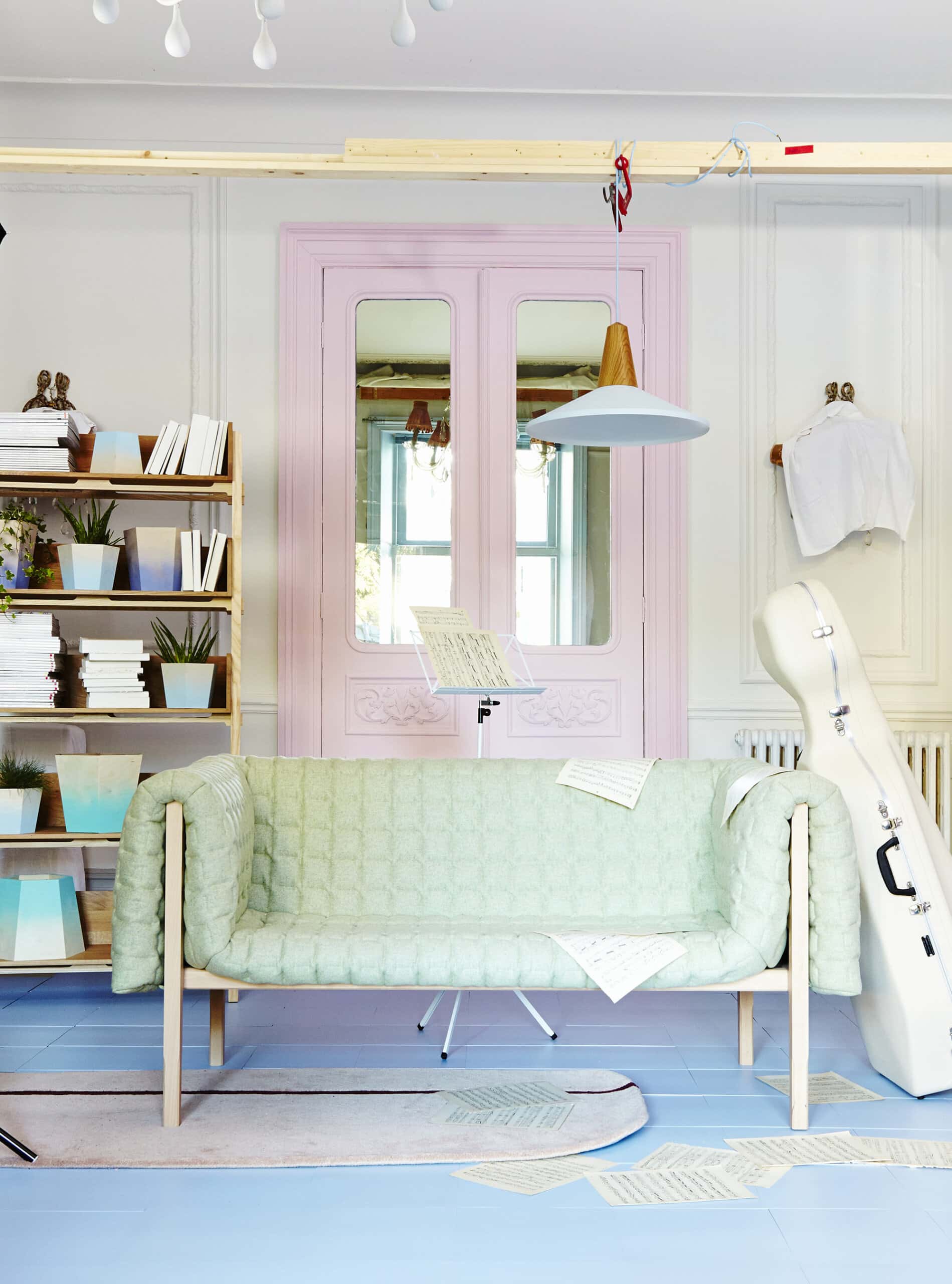
When it comes to using pastel colors as part of your decor, there is no one-size-fits-all solution. If you want your space to have a more cottage vibe, try using a variety of pastel colors.
To keep it classic, stick with one hue and change its tone instead (think of staying on the same paint chip throughout the room). If you want a more laid-back atmosphere, consider painting more significant pieces of furniture or an accent wall in a soft pastel hue.
Use pastels solely as accents if you’re going for sleek and sophisticated looks. Making these design choices will assist you in selecting the right pastels for your project.
2. Sway Away from Traditional Shades
Pastel hues conjure up images of Easter baskets filled with colorful candies. With so many pastel color options available today, it’s easier than ever before to get inspiration for your home’s interior design by visiting your local paint shop.
If you don’t have access to a paint shop, look at these palettes for some ideas. When using pastel colors, consider whether you’d want to use them as an accent hue to make a room seem more fun and breezy or as a focal point or splash of color in a drab area.
To make a space seem more open and breezy without being too bright, use pastels that are closer to neutral (yellow, cream, peach), those with a natural emphasis (green, blue, tan), and the more fun pastels (pink, purple, orange).
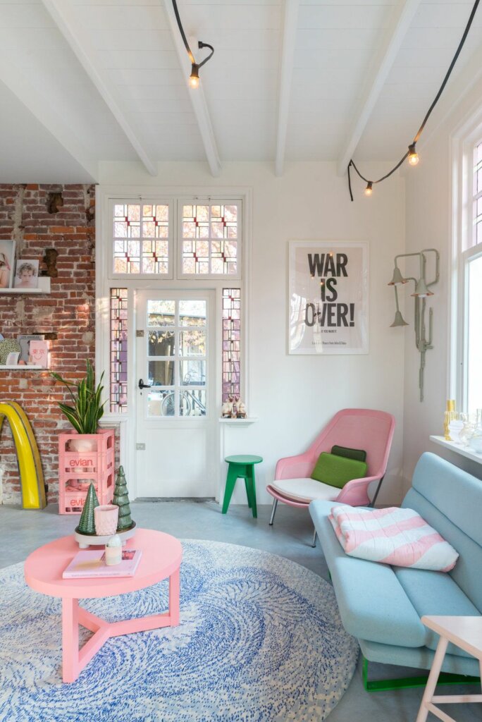
3. Mix Pastels with Bold Colors
The “all or nothing” approach to decorating may get in the way, as in “I’m going to turn the entire room pink!” To one’s relief, the craze for utilizing different hues and tones of the same color in different rooms has long since gone.
If you want to use pastels for the season but don’t want your space to seem too light or sugary, consider combining pastels with bright colors from the same family.
Look at these marketing samples or this breakdown to see how anything from gold-framed mirrors to colorful drapes can make your pastels shine for fantastic guidance on how to combine pastels with stronger tones.
4. Color Natural Items with Pastels
Try combining your pastels with natural materials for some grounding if you normally avoid pastels because they seem too feminine. You may easily combine pastel highlights with a stable base in your space by using a cream or tan wool/jute rug of similar color.
If you want to utilize pastels as a colorful pattern on the floor, go with natural wood furniture, linen couch/chair covers/etc. As the natural aspect.
A striking light fixture made of natural materials will go well with your pastel interior design for a striking appearance in any area (and a table lamp is an excellent choice for a smaller room).
5. Don’t Forget to Incorporate Blacks
As paradoxical as it seems, adding a few touches of black when you’re going for pastel decor can help balance the lighter hues and elevate your space.
In addition to providing a neutral resting place for your visitors’ eyes, black accents will keep your pastel décor from seeming cluttered and childish. Throw pillows are a low-cost and simple way to incorporate black into your decor.
Patterned clothing may help the black seem lighter, allowing it to blend in with the pastels better. A black end table anchors your room while also highlighting the design theme you’ve selected.
Conclusion
The ideas shown here are just examples from which you may draw inspiration; ultimately, your choices are personal, and there is no right or wrong answer. It’s fun to choose out your home’s colors, furnishings, and patterns, and that’s what makes a house seem like a home.
The materials used to construct a house of this grade should be of the highest standard, so check with the custom home builders you choose to be sure they deliver on that promise.
With pastels, the possibilities are endless. In the past, pastels were used mostly in children’s rooms and spring, but now you’ll see them throughout the home year-round. The sources from which people receive their creative inspiration vary.
Browse the vegetable section of your favorite market, or go for a stroll around a botanical garden if you like. If you look around, you’ll see how many natural pastel hues there are all around you. Set your sights on a certain space, and then let your imagination go wild with fresh pastel hues.